About
About
About
About
About
About
About
About
About
About
About


Project Type
Year
Duration
UX/UI Design
2021
4 months
An anonymous dating and self-development app by BaTalk Ltd.
Team
UX/UI team (4)
Engineering team (3)
Marketing team (4)
Work at BaTalk Ltd.
BaTalk Ltd. is a Taiwanese start-up company founded by three young talents. I joined the team when they have worked on the projects for 8 months. The team needed a fresh eye on Me Loop, so I was responsible for identifying and solving the problems that I found while using it. It was my first time using Me Loop. I documented the problems and discussed them with the teams 1-2 times per week.

Me Loop is a dating and self-development app for
college students in Taiwan as a simulation game experience.
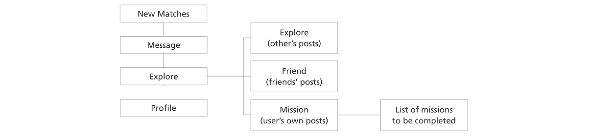
Refine the "Explore" and "Mission" User Flow
Users shared completed "Mission" on the "Explore" page, which is the second channel for users to meet friends. "Mission" not only documents users' life stories for self-regonition but also allows users to find people with similar interests for possible matches. However, there were very few users participated in the explore and mission features when I joined the team.
Users' Needs and Problems
As a new user to just downloaded this App, I was excited to meet new friends, to see what everyone was up to, and to get more involved in this community. There were a few problems with the original user flow:
-
Too many tabs inside the page of the tab bar. Users got confused and were less likely to click on other tabs.
-
The "Explore" and "Friend" shared the same kinds of information. As for new users who have not had any matches yet, the "Friend" page is empty. If the user's friends do not have any new posts, the user will keep seeing the same information over time.
-
A user does not need to explore his/her own post, but it can be documented somewhere else.
-
The list of missions was hidden. By the time I found it, I have lost my excitement.
(user flow before the redesign)
Refinement and Problem Solving:
Based on the problems, I created a refined user flow and shared it in the weekly meeting. The team agreed on moving forward with it. The redesign solves the problems by:
-
Simplified the tabs with to main tasks browsing others' posts and making my own post
-
Combined the others' and the friends' posts to the same page, but still clearly show the differences
-
Moved the user's posts to the "Profile" page, so the user can reflect on himself/herself and the others can also browse through an individual's post to get more understanding about him/her.
-
Decreased the steps to reach the list of missions.

(explore and mission user flow redesign)
Evolve the Explore Wall
At the time, the individual mission showed very little information about the post and the person who post it. As a user who wants to meet more people or maintain the relationship with current friends by browsing through the posts, I have to at least know who post them. It would be better if there is more elements that catch the user’s attention. Seeing the others who have completed the same mission or high number of likes can be the hooks.
Design Goal
-
Fit more information into a small cube on a small screen while maintaining its legibility
-
To allow users to view more details of the post, and browse through numbers of posts quickly, I am turning it into two columns of posts instead of three
-
Clearly show the differences between others' and friends' posts
What Information Should Each Post Include?
In order to make sure everyone in the team is on the same page and to have a clear guide for me while ideating, I listed the components in hierarchy by referencing other social media App, the direction of this page, and possible users' needs:
-
Image of the post
-
User's name
-
User's profile picture
-
Mission name
-
Number of likes
It was not necessary, but it would be nice to have. Therefore, I kept it in mind while ideating.
6. Mission characteristic

(explore wall before the redesign)
Sketch Quickly and Expand the Variety in Digital
For the speed and the flexibility, I started with hand drawing. To increase the accuracy of visual communication, I picked a few rights after sketching and digitalized the wireframe. To have more options to choose from, I expand the variety in detail.
(wireframes of the individual post on the explore wall in the ideation phase)

Testing and Narrowing Down the Ideas
To reduce the time of discussion during our weekly meeting, I narrowed down the options while working. I make my decisions by seeing the designs under a real scenario - in a cluster and on a phone. I tried to press the buttons to see if it is too small for my fingers. I also applied different photos to the designs to see if the information is still legible.

(testing under rea scenario for self critiquing and decision making)
Putting Together the Delivery for Both the Users and the Teams
After a few rounds of meetings and refinements, the team and I settled on a delivery that is the combination of a few ideations. There are a few reasons why we went for this design:
-
The profile pictures are small enough to fit in the post section, but still recognizable.
-
The title space can accommodate the longest school name in Taiwan with the gender symbols, which also aligned with the landing match page.
-
Both the mission titles and the numbers of likes are clearly showed as a third read with any images.
-
The mission characteristic tags can also be shown clearly and cohesively as the team wanted.
(redesigned explore wall)

Additional Elements - Mission Filter and Search Bar
I had a concern if the users have problem looking for a specific post or certain kinds of post, so I added the search bar and the mission filter function. While the marketing team promote Me Loop with "hot topic" mission, it will also be practical.
In order to keep the user flow simple, I choose to place mission filter directly on the page after a couple rounds of user flow prototyping and discussions with the team.
Imrpoving Me Loop
While I was working at BaTalk, I also made on other UX and UI improvements on Me Loop.
Refined the Experience of Landing Page for Different Situations
Accroding to my user testing, new users got stuck on the landing page. There should be more call-to-action buttons that lead the users to other functions in Me Loop.
The mood of Melo also turns down my excitement while using this App. I believe that the mood should be transformed in different situations. As a user and a designer, I sorted out three situations:

Coordinate the Message Scenario
On the "Message" page, there were three tabs for categorizing matches, but it not only creates extra steps but also confused the users. To simplify the scenario and keep the information clear, I combined three tabs into one page. The friends are listed with labels instead.
A user told me that he has been using Me Loop for a month, but did not know that he can send a friend request until I do so. Therefore, the redesign shows and friend request directly on the screen with a clearer icon.


(hover to see the new design for chat and message page)
Reflection and Next Step
Seeing updates of Me Loop got released and grew in the market gave me enthusiasm for this project. I found
my way to be self-motivated while working remotely. I was able to focus on one task at a time, and move the progress forward by making a clear list of tasks and setting the priority every day for every week. I also learned to be more aware of the details and consistency trough out the app while working on the UI design.
I was proud of our progress on Me Loop in a few months, even so, there are always parts that I can improve. I plan to keep learning and practicing material design and interface prototyping.
I did not get to participate in the user testing and the data analyzing phase, but I believe they are the next important steps for Me Loop.